Phases of Website Redesign: The Ultimate Guide for Marketers
The first website redesign project I led was a six-month-long baptism by fire. I learned everything on the fly, which is a great way to grow and get hands-on experience — and also a highly effective way to breed stress and anxiety.
To save you some of the latter without sacrificing any of the former, I’ve written a guide with tips on building a successful redesign strategy, whether you’re working with an agency, doing an in-house redesign, or proposing a redesign to company stakeholders.

I’ve spearheaded multiple website redesign projects, and I can tell you firsthand: The more clearly you define your vision at the very beginning, the smoother the entire process will be — and you’ll see better results, to boot.
Many organizations decide to redesign their website in order to drive more traffic as their business grows. Others invest in a website redesign as part of a larger rebranding initiative.
In one redesign project I led, an in-house product team worked for six months to make significant structural updates to an existing CMS to accommodate my team’s complex needs.
In another project, we decided to scrap the existing CMS and rebuild and redesign it from the ground up.
For that project, we took extra time to consider the foundation and structure of the redesigned site so that it would be usable for many years. We built it to be structurally sound and exceptionally flexible, making it easier (and cheaper) to handle future refreshes.
Regardless of why your company is interested in a website redesign plan, it’s likely to be a massive project.
It’s also an endeavor that’s vital to get right, considering the critical role your website plays in your marketing and brand image. If consumers can’t quickly and easily find the info they’re looking for on your site, you’ve already lost them.
How Often Should You Redesign Your Website?
It may be tempting to give in to changing design trends and advancing technology. But your website may last longer than you think.
I asked Simon Strande, the CEO and CTO of Webnorth, a Denmark-based web development company, what the average website lifespan was. Strande has been building websites for nearly 15 years, and he says that in general, “the lifespan is actually increasing.”
Although he says that the standard lifespan is two to four years, “looking at our clients, it can be quite a bit longer, depending on the initial development of the platform and how flexible it is.” If the site has built-in flexibility and room to scale, you probably won’t need a completely new website every two or so years.
There are two big caveats to that: maintenance and technology.
Strande says that “if the system has been very poorly maintained, then the lifespan won’t be as long. And sometimes the client doesn’t even know it’s poorly maintained — the system just gets slower and slower.”
And sometimes, technology shifts so significantly that you need a full redesign just to keep up. Strande says that he started working in web development before responsive websites — mobile-friendly websites that adapt to the user’s device — were necessary.
“That was a big period in development,” he says. “Often we could accommodate existing designs to be responsive, but many times the website was just never designed in the beginning to be responsive.”
If your website works for both you and your users and has been appropriately maintained, but the branding or design feel dated, you may want to consider a website refresh instead.
How to Determine if You Need a Website Refresh
A website refresh updates non-structural elements like graphics, fonts, and brand colors — which may be enough to stave off a full-scale redesign for another year (or more), or until you have functional reasons to do a full redesign (more on those later).
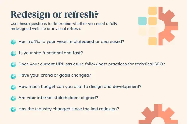
The following questions can help you determine whether you need a redesign or a refresh:
- Has traffic to your website plateaued or significantly decreased? Dips in traffic can be a complicated problem to untangle, and a major slowdown in page views is often due to a variety of factors.
But if your site is no longer converting the same amount of traffic, if users bounce after only a few seconds, or if pages-per-visit numbers decrease, your website may have outlived its functionality.
- Is your site functional and fast? Step into your customers’ shoes and see if you can easily navigate the site and find what you’re looking for without encountering errors or long page load times.
In our 2024 survey of 300+ web strategists, HubSpot found that 20% of websites get between four and six page views per visit — and over 50% receive six views or more per visit. (We’ll publish the findings of that survey later this month, so stay tuned.)
All that browsing means that your site’s navigation and speed really do matter.
- Does your current URL structure follow best practices for technical SEO? If you’re not thinking about this from the beginning, says Strande, “you can have big problems later, not just with the structure of the content and data, but with search engines.”
This can have devastating implications: “The worst thing that can happen is that you have to rebuild the entirety of the search engine presence that you had before.” Strande’s next words are chilling. “For some businesses, that has been an unrecoverable loss.”
- Have your brand or goals changed? If you’ve materially altered course since your last site redesign — maybe your business has adjusted its value proposition or mission, or maybe you’ve exploded in growth — your website may no longer represent who you are as a company.
Strande says, “What we see a lot is websites that were made when the company was not that mature. And now that the company has evolved, can the website evolve with the new demands?”
Sometimes you can “put a kind of dressing on it without having to change it overall. But sometimes the brand change is so big that you have to ask yourself whether a refresh makes financial sense.”
- How much budget can you allot to design and development? Can you put in the resources and budget required to deliver an outstanding redesign? Also consider whether you’ll strain internal resources if people are reallocated to a major redesign.
- Are your internal stakeholders aligned? It takes a village, as they say. This particular village includes designers, developers, SEOs, online marketers, content creators, and more. Take stock of different pain points and what problems everybody is trying to solve. This can be a great indicator for how extensive the redesign needs to be.
- Has the industry changed since the last redesign? For example, when Google announced that it would be changing to mobile-first indexing, websites had to become mobile-friendly or risk losing organic traffic from Google.
If your site still functions properly and just looks a little dusty, you can address design elements like colors, fonts, and branded photo treatments without going back to square one.
I’ve found that building the plan can take as long or longer than the actual redesign process. Think of it like laying the foundation for a house — if you don’t get it right the first time, it can’t support the internal infrastructure, much less design details.
If you’re wondering what should go into your website redesign strategy, start with the following steps.
Below, I’ll unpack these 10 critical website redesign tips to think about when planning and completing your redesign.
1. Benchmark your current performance metrics.
Before you begin planning your website redesign, it’s important to document your current performance metrics. This will give you a good idea of where your current website stands and what metrics you can improve upon through your redesign.
This also lets you measure growth (or any other metrics) that the redesign is directly responsible for.
If you’re not sure where to start, I recommend analyzing your existing website’s monthly performance in the following areas. The importance and relevance of each may vary depending on your website redesign goals, but I’ve found that it can be helpful to look at many of these metrics before diving into a redesign:
- Number of visits, visitors, and unique visitors.
- Bounce rate.
- Time on site.
- Top-performing keywords in terms of rank, traffic, and lead generation.
- Number of inbound linking domains.
- Total new leads and form submissions.
- Total sales generated.
- Total pages indexed.
- Total pages that receive traffic.
If you don’t currently have access to this information, tools like Google Analytics and HubSpot’s Marketing Analytics can provide data.
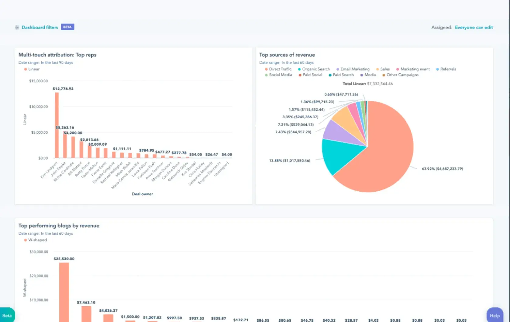
Image Source
Pro tip: Remember to note which tools you use to measure each of these benchmarks. That way, you can use those same tools again when collecting your post-redesign metrics and thus avoid comparing apples to oranges.
2. Determine your website redesign goals.
What’s the “why” behind your website redesign?
If your answer is, “Well, it’s been a while since we’ve done one,” or “My competitor just redesigned their site,” you’re not likely to be happy with the result. When it comes to investing in a website redesign, there should always be a good reason to do it.
Some basic user testing can go a long way if you have the time and resources — you’ll start to note patterns after five or so tests, so this doesn’t have to be extensive.
But word to the wise: If you’re only testing a small number of users, be mindful of how you interpret and use the results. They may confirm your hunches or give you guidance, but avoid making a huge structural change to your site based on just a few user opinions.
If you’re able to talk to users, record the sessions and have the users share their screen with you, so you can watch how they navigate your site. Ask them to talk you through their thought process as they answer the questions.
I also find it helpful to write up a brief recap immediately after each user interview — it helps me find patterns more efficiently.
Whether you’re doing the audit yourself or interviewing users, here’s a few questions I’ve used in the past that you can adapt to your specific needs:
- Ask the user to find a specific page on your site. Take note of the path they take. Was it different from what you expected?
- If you’re testing a specific feature, like a button or new navigational tool, ask why the user clicked on one element instead of another.
- If you’re testing new editorial features, ask what kind of content the user would expect to see under a certain topic or theme.
- Ask what other websites the user frequents, specific to your product or service. For example, if you sell budget travel packages for Gen Xers, ask where else they look for similar experiences.
Again, if you’re doing this yourself for the first time or are on a shoestring budget, the answers to these questions shouldn’t be the sole determining factors for any redesign changes.
If you get surprising results, you may find it useful to partner with UX pros to do more structured, extensive testing. But even a small-scale audit can give you some supporting data or quotes to augment your recommendations for a redesign.
Remember: It’s not just about how your site looks but also how it works. Be crystal clear about why you’re doing a website redesign, and tie those goals to measurable results. Then, communicate your goals with your team, designer, or agency.
Consider the following data-driven objectives for your own website:
- To increase the number of visits and visitors (both are important, as one visitor could visit more than once).
- To reduce bounce rate.
- To increase time on site.
- To improve domain authority.
- To increase new leads and form submissions.
- To increase total sales generated.
- To enhance SEO rankings for important keywords.
Many of these goals are dependent on one another. For example, in order to generate more conversions, you may need to increase traffic while also decreasing your site’s bounce rate.
Take a look at the metrics you pulled out in the previous step. Are there any that you can improve upon with your new website? Perhaps you can use your old website metrics to inspire new goals.
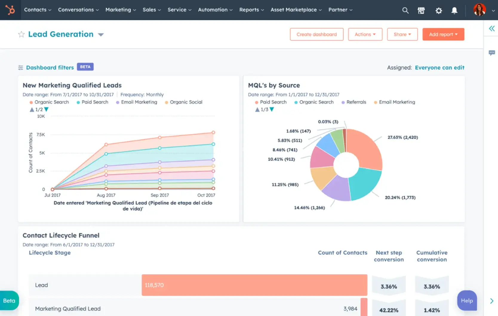
Image Source
What I like: You can use HubSpot’s custom dashboards to track performance on the metrics that matter most to you — and then use that past performance data to inform your forward-looking goals.
3. Define your branding and messaging.
Back to our house analogy: You need to have a floor plan before you can lay the foundation. And while you don’t need to pick out paint colors at this stage, you do need to know things like architectural style and where the plumbing will go.
Similarly, before you can redesign your website, you’ll want to be crystal clear about desired branding, messaging, and unique value proposition.
If this is likely to be a source of friction with other stakeholders, resist the temptation to forge ahead with the redesign. Your site will be more successful and have a longer life if the stakeholders are aligned.
First-time visitors to your site should immediately understand what you do, how it may benefit them, and why they should stay on your site. Otherwise, you’ve just given them a reason to flee to your competitors.
For example, take a look at HubSpot’s homepage below. It’s immediately clear what the company does, what it offers its customers, and how any visitor can get started:
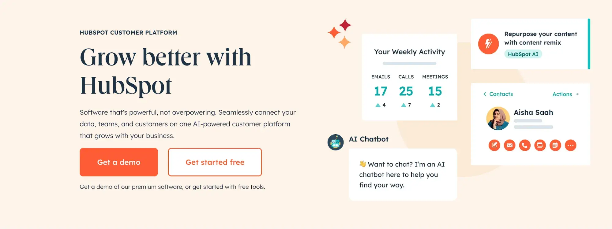
Image Source
Think about whether you plan to change your branding and/or messaging in the near future or if you expect it will stay the same for a while. If you do plan to change it, what will you need to change? Keep these changes top-of-mind as you redesign your website.
Download this free workbook for guidance and templates to simplify your next website redesign project.
Additionally, as you develop your company branding, consider which visual aspects of your website need to be redesigned and what can stay the same. Have you created a new logo, style guide, or color palette? Make sure these are applied to your new website, so it remains consistent with other parts of your brand.
Pro tip: For some more inspiration, check out this roundup of B2B website examples:
4. Define your buyer persona(s).
Your website is not just about you. In fact, it’s hardly about you at all.
When your visitors land on your website, they’re asking themselves, “What’s in it for me? How could this company help me?”
So don’t make your website all about you. Instead, speak to your visitors in their language by crafting your website design and content around your buyer or user personas.
For instance, if you’re a marketing manager at a hotel looking to bring in new business, you might target five different buyer personas: an independent business traveler, a corporate travel manager, an event planner, a vacationing family, and a couple planning their wedding reception.
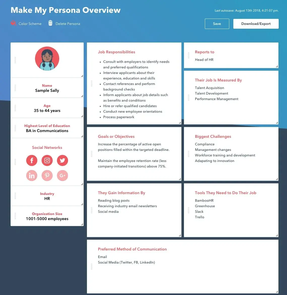
Image Source
Make sure you clearly identify your buyer personas, so you can shape your website redesign strategy around the kinds of website visitors that matter most to you.
What I like: Check out HubSpot’s handy buyer persona builder to help you create detailed buyer personas.
Finally, ask yourself: Is your target audience changing as part of your website redesign? And if so, do your branding and content align with this new audience?
Answering these questions will be vital as you’re strategizing about your website redesign.
5. Protect your search-engine-optimized pages.
Getting discovered online is essential to improving your website’s metrics. After all, if no one is able to find and visit your site, how can you increase new leads, conversions, or sales?
Here are three of my top tips for designing your new website with search engine optimization (SEO) in mind:
Document your most search-valued pages.
First, use marketing analytics to figure out which of your website’s pages currently receive the most traffic and inbound links, convert the most leads, and cover the most influential topics in your industry.
Write down a list of these highly valuable pages, and if you plan to move any of them, make sure you create the proper 301 redirects.
Create a 301 redirect strategy.
Next, speaking of 301 redirects, these are extremely important in terms of retaining the traffic and link value associated with a given page.
Create a spreadsheet to record and map out your 301 redirects (old URLs vs. new URLs). Then, hand this document over to a technical expert to make sure all the necessary redirects are properly implemented.
Do your keyword research.
Finally, when crafting your newly designed website, pick one keyword or topic for each page to focus on. Once you identify these keywords, use on-page SEO best practices to optimize your website pages.
You can also consider adding new content and pages to your website that address keywords or topics that may be neglected on your current site.
Save time and rank higher on Google with our free on-page SEO template.
Pro tip: HubSpot’s SEO Marketing Software can give you insights into your website’s current SEO performance, helping you optimize your website redesign plan.
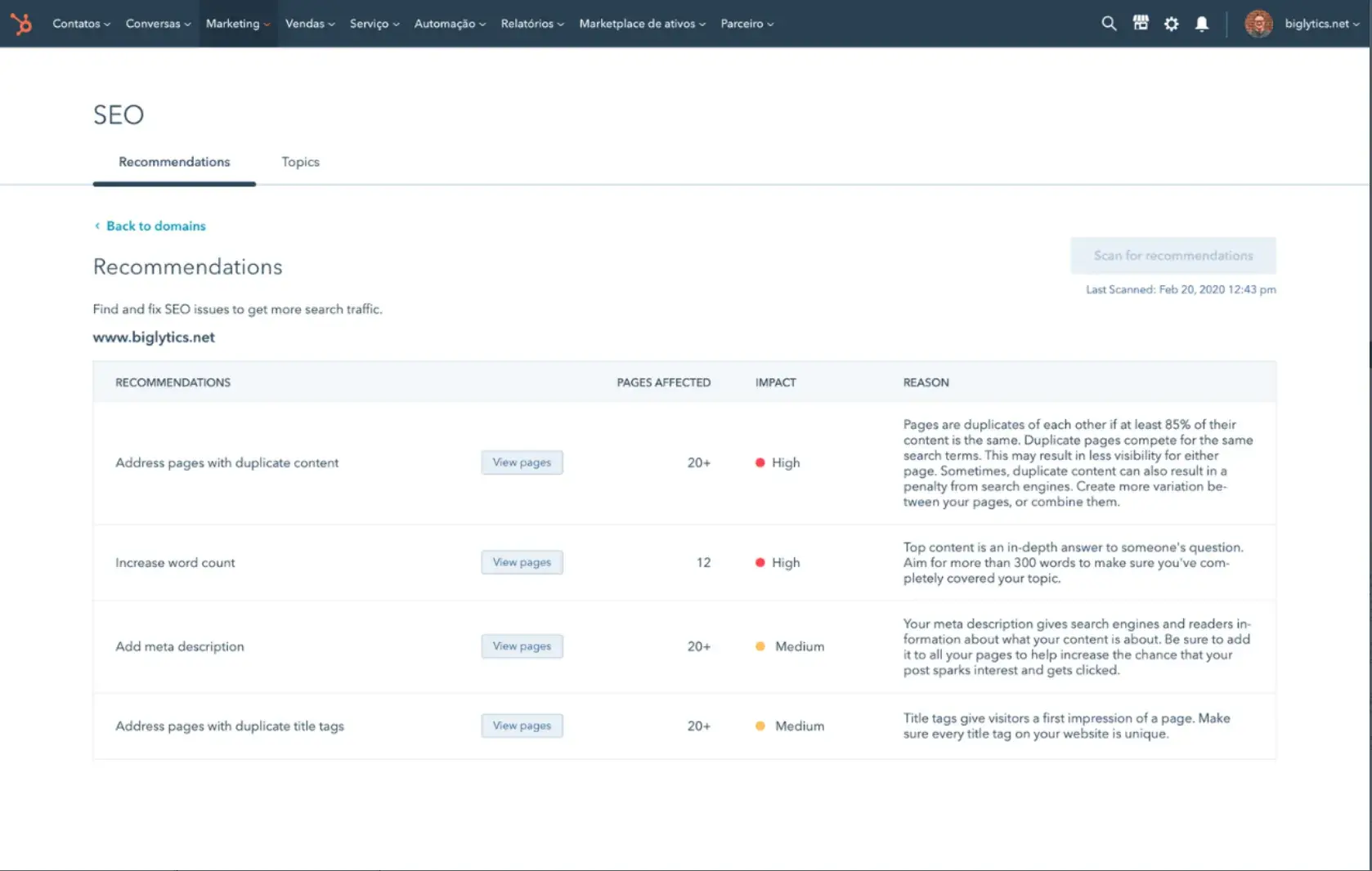
Image Source
6. Analyze the competition.
While I don’t recommend obsessing over your competitors, knowing how you compare can be helpful. To that end, I’d suggest running your website through HubSpot’s free website grader tool to generate a report card on how well your website is performing.
You can then use this diagnostic tool to evaluate your competitors’ websites, so you’re aware of their strengths and weaknesses as well as your own.
Pro tip: HubSpot’s AI search grader tool is a great way to gain insight into how AI search engines perceive you — and your competitors.
Next, take a look at your competitors’ websites, and take note of what you like — and what you don’t.
Once you conduct these competitive analyses, you can use the insights you’ve uncovered to put together a list of action items highlighting some areas for improvement and ways you can use your website to set yourself apart from your competitors.
7. Take inventory of your high-performing content.
While a redesign is a great way to improve the performance of your website, it’s not without risk: In fact, if you’re not careful, it can end up harming your website’s performance.
This is because your existing website likely contains many high-performing content assets that you’ve already built up, and if your redesign causes them to become less effective, it can severely damage your marketing results.
Pro tip: HubSpot’s SEO Marketing Software can help you identify your existing top-performing pages, so you don’t end up harming your performance through your website redesign.
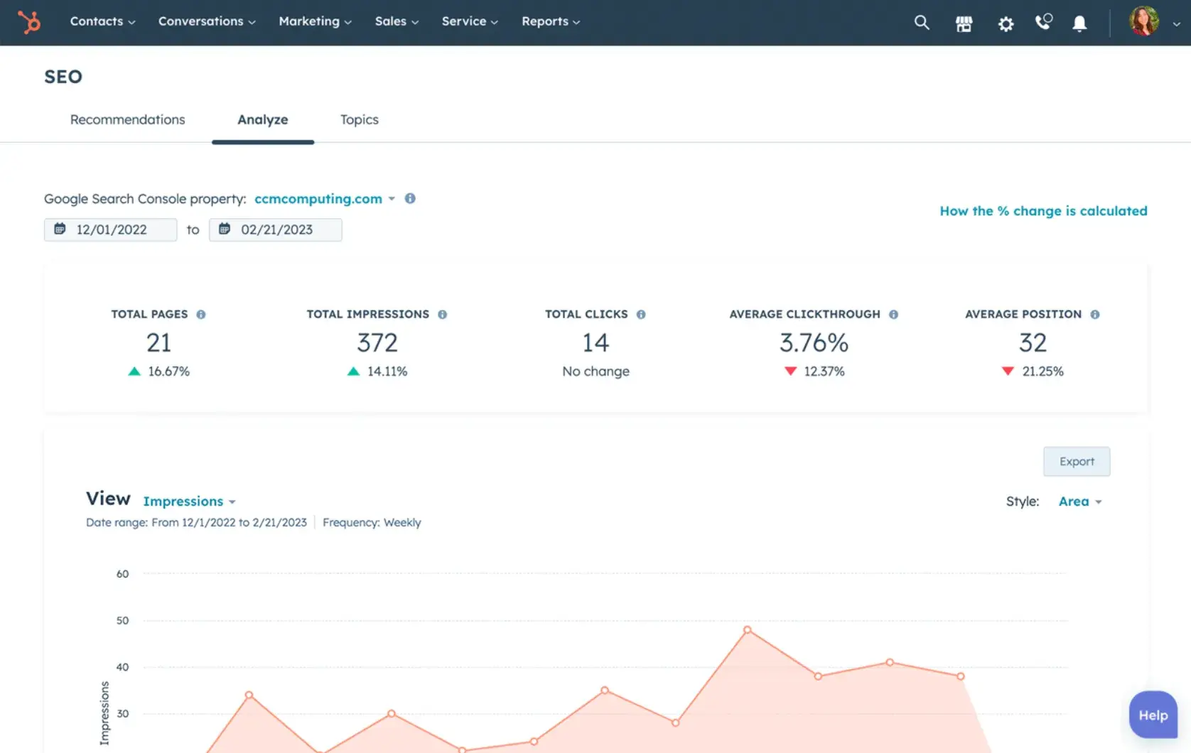
Image Source
For instance, these high-performing assets might include your:
- Most-shared or most-viewed content.
- High-traffic pages.
- Best performing or ranking keywords and associated pages.
- Number of inbound links to individual pages.
For example, if you end up removing a page from your site that has accumulated a high number of inbound links, you could potentially lose a lot of SEO credit, which would make it harder for your site to be found on search engine results pages (SERPs).
Don’t hesitate to remind stakeholders about SEO considerations and help them along by auditing your site and providing them with a list of critical pages to be sure to maintain or update.
8. Choose the right software.
One of the most important steps in the website redesign process is choosing the right software to create and host your website. This software is typically called a content management system (CMS), and it’s used to develop, design, and publish your website for the world to see.
Whether you’re a novice digital marketer or a pro web developer, a CMS can help you build a gorgeous, functional website with ease. Of course, determining which CMS is right for your needs will depend on your unique business, the features your website redesign will require, and your level of familiarity with different CMS tools.
Strande says that he’s seeing more clients choose a headless CMS, which he says allows you to “change the entirety of the front end without having to change the backend.” The pro is that “it can really increase the lifespan of the platform.” On the other hand, “it’s often a higher initial investment.”
There are hundreds of CMSs to choose from, including HubSpot’s Content Hub. You can also review some of the best CMS platforms to learn more about the range of available options.
What I like: HubSpot’s Content Hub gives you the tools you need to get your website redesign off the ground.
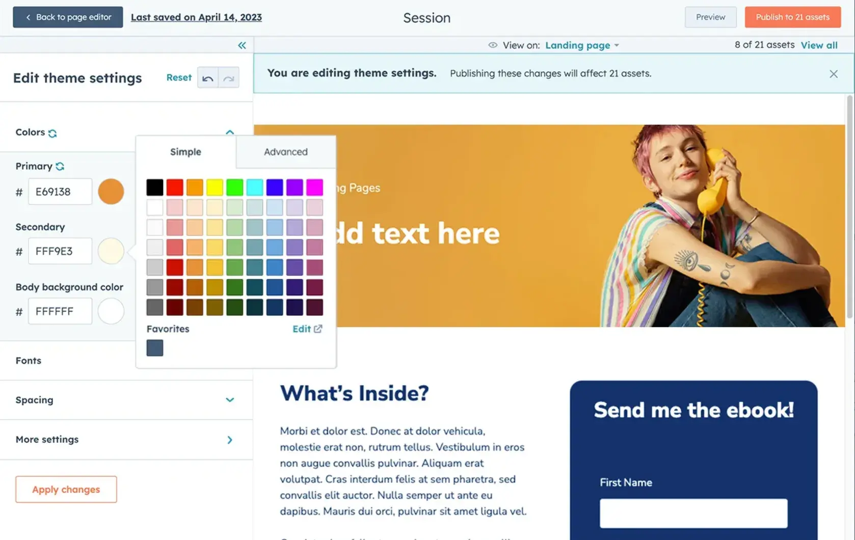
Image Source
9. Migrate your content.
If you’re working with a technical partner, ask them early in the process how they typically handle content migration. This can be a huge — and hugely expensive — job, and it’s not always included in the redesign quote.
If you have a small amount of content, or are building a site for the first time, this may be something you can handle on your own. But if you have even a moderate amount of content, trying to do a manual migration is a daunting, time-consuming task.
10. Make a post-launch checklist.
The period immediately after a website relaunch is a critical time: You’ll find bugs or other glitches, a stakeholder will ask why a logo is purple when they thought it would be green, or links will be broken.
Don’t panic! Even the best-laid plans always have a hiccup or two. I like to allow an extra two weeks after a relaunch to find all the bugs. (Then I take a long vacation; web relaunches are a lot of work.)
Here are a few things to keep in mind after a relaunch:
- Implement a bug-reporting system. Stakeholders should know how to report any bugs they find, whether that’s using an automated system or simply Slacking a single person who can track everything.
- Spot-check your new site for broken links and images. Look at some of your highest-performing pages. Are there any glaring errors, like broken links, broken images, or formatting issues?
- Check for 404 errors. After leading a web relaunch that involved significant changes to URL structure, I found that a number of pages were still returning 404 errors. Solutions to 404 errors can get somewhat technical, so consult with your tech or product team before setting up redirect links yourself.
- Have a plan for your old website. If you’ve built a brand new website and migrated your old content, you may effectively have a duplicate of your entire website. In most cases, this won’t turn into a problem — your tech or product team will follow best practices to make sure the transition is seamless.
But in one redesign I worked on, this became an issue because we migrated the content in stages — meaning that we needed two active websites for a period of time.
Google doesn’t like duplicate content (even if it’s all under the same domain), so we had to implement some technical solutions to minimize any SEO damage.
Budget for a maintenance plan. Properly maintaining your website is one of the most important factors in its lifespan, so don’t cut corners here.
Testing It Out: Designing a Digital Portfolio
HubSpot contributor Allie Decker put these steps into action and helped program manager and content editor Katilin Milliken redesign her personal website.
This is Milliken’s online portfolio, showcasing her work throughout her career. However, it hadn’t been updated in a few years. Here’s how Decker approached this project.
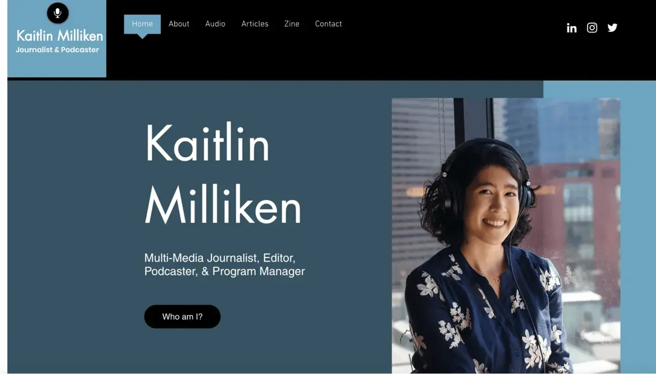
Discovery: The Goals of the Site
Before actually making changes to the site, Decker talked to Milliken about goals. She sent the following questions:
- What are the goals of your website design?
- What’s the vision for or purpose of your site?
- Who is your audience?
- Are there any specific changes you would like to see?
Here’s how Milliken responded.
What are the goals of your website design?
“I initially created this site when I was a business journalist to capture the different articles and multimedia stories I worked on. I’ve since switched over into program management and working in tech. I want my site to tell the story of that career shift and to explain how the skills from my past career have transferred to my new one,” Milliken says.
What’s the vision for or purpose of your site?
“This site should showcase my professional accomplishments and the past positions I’ve held. Think of it like a digital resume with more examples. I also want to highlight metrics that demonstrate the impact of my initiatives,” Milliken says.
Who is your audience?
“The audience should be people who want to work with me in the future. I run a freelance program at HubSpot. People who want to join should be able to learn how from my site,” Milliken says.
Are there any specific changes you would like to see?
“The current site’s color scheme is very colorful and fun. While I loved this at the time, I want my site to feature a more sleek design. I also want to update the images. These pictures are from over six years ago,” she says.
She continues, “I also want to remove the portion about my personal art projects and zine. I’ve migrated that to a different site.”
With those goals and instructions in mind, Decker was able to start the redesign process.
Rebranding and Rewriting
While many of Milliken’s asks relate to the design of the site, refreshing the text offers a better place to start. This involves reshaping the messaging of her site so it reflects her current goals — telling her career story to people who may want to work with her in the future.
Let’s start on the home page.
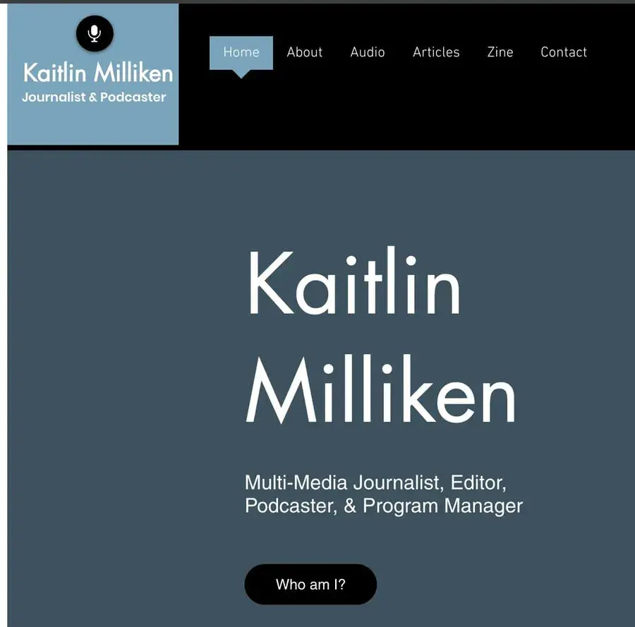
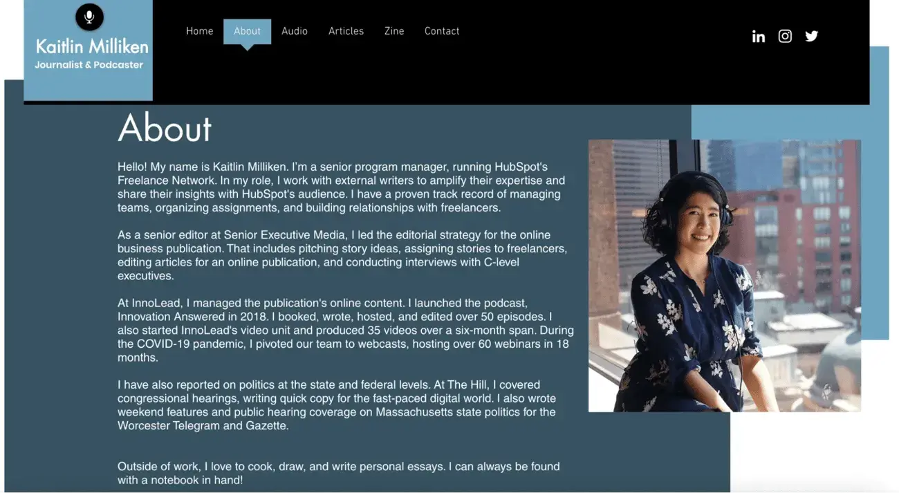
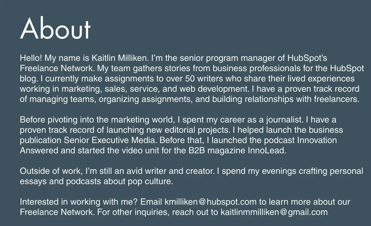
Now, let’s turn to her about page. The copy focuses too much on her previous experience, so Decker rewrote it to emphasize her more recent accomplishments and to tell the story of her career transition.
Making Design Changes
Milliken explicitly asked Decker to change the color scheme and theme of the site. Since they were using Wix, Decker started with the prebuilt themes that were most compatible with her website.
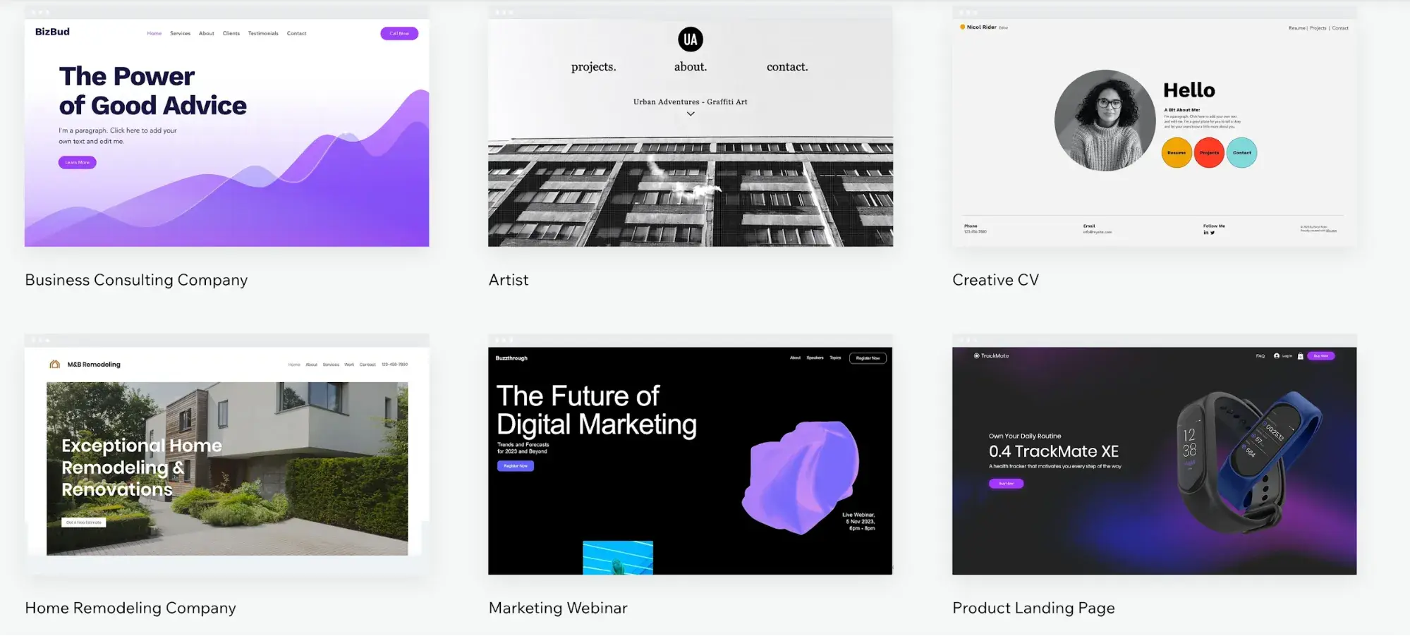
Image Source
Decker settled on a theme with a limited color scheme. Primary colors are used to highlight specific areas of the site, and all photographs are in black and white.
(If you, like me, struggle to find cohesive color schemes, I like Khroma and HubSpot’s Brand Kit Generator. They’re both fun to play with and will give you lots of ideas.)
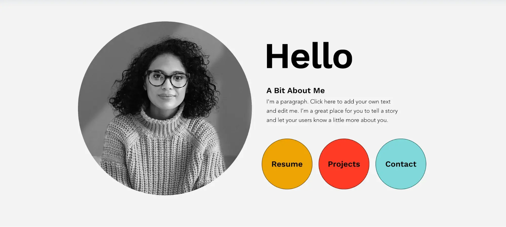
Image Source
Beyond that, Decker built a limited menu and merged the audio and stories section into one page called “Projects.” This aligns better with her current program manager role and focuses more on initiatives built than individual stories completed.
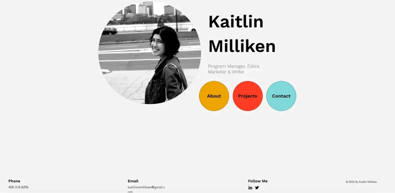
From there, Decker copied the new text and swapped out her older pictures for new ones, as requested.
For a larger relaunch project, this step will look very different. If you need to migrate old content onto the new site, take another look at my section on content migration — and don’t underestimate the time and technical know-how that this step can take.
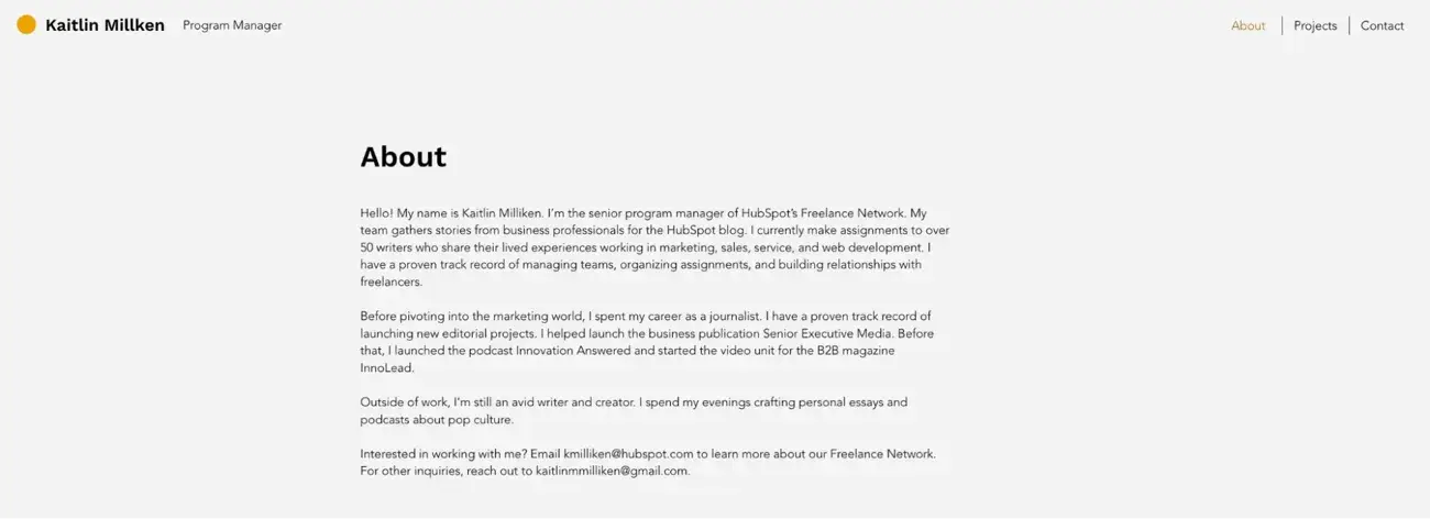
Outcomes
Decker says, “Creating a simpler site allowed the purpose of the site to shine. I was able to capture the evolution of Milliken’s career and find an aesthetic that suits her preferences.”
Get Started on Your Website Redesign Today
Whew! Now you’re ready to plan, design, build, optimize, launch, and analyze your new website. Apply these seven steps to redesign a website that attracts more consumers, wows more visitors, and converts more customers.
![]()
این خبر را در ایران وب سازان مرجع وب و فناوری دنبال کنید
جهت دانلود و یا توضیحات بیشتر اینجا را کلیک نمایید
این خبر توسط موتور تهران اقتصادی جمع آوری شده است در صورت مغایرت اطلاع دهید
دیگر رسانه های کشور:
آموزشگاه رسانه |ارتباط اقتصادی| ارتباط فردا|ارتباط فرهنگی|ارتباط ورزشی|تهران اقتصادی |تهران ورزشی|مرجع وب و فناوری|پایگاه خبری شباب |همسونیوز|تهران فرهنگی


